CONTEXT
When I joined the Concordia Esports Association in late 2014, the club was just coming into its own. With inter-university gaming competitions popping up everywhere, we knew we had to be ahead of the curve and not only have a great club to represent our school, but to have a strong and recognizable image. With the popularity of esports becoming apparent, we know we had to forge an identity that not only resonated with us but as well as our student body.
MANDATE
Being the club for all Concordia University students (past, future, or present) interested in video games, we looked to create an image that not only represented that school but as well us gamers. The new branding would need to connect students, be the emblem of the club for all social media, broadcast, events and potential merchandise.
ABOUT THE LOGO
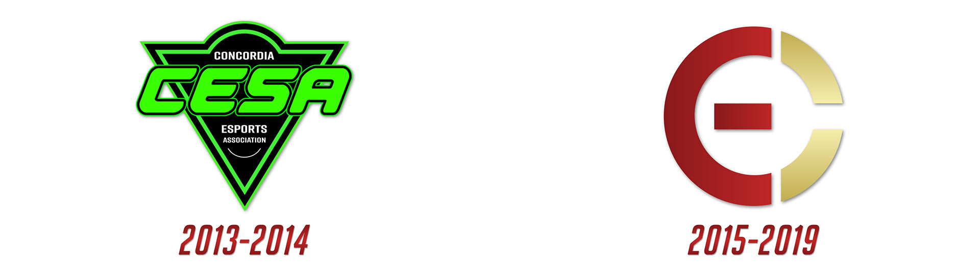
The new red and gold logo was designed in order to reflect the clubs gaming nature in the shape of a power button with a
"C" and "E" embedded in it. Furthermore, the chosen colours reflect our university's signature colour combo, while still being stylish.
"C" and "E" embedded in it. Furthermore, the chosen colours reflect our university's signature colour combo, while still being stylish.
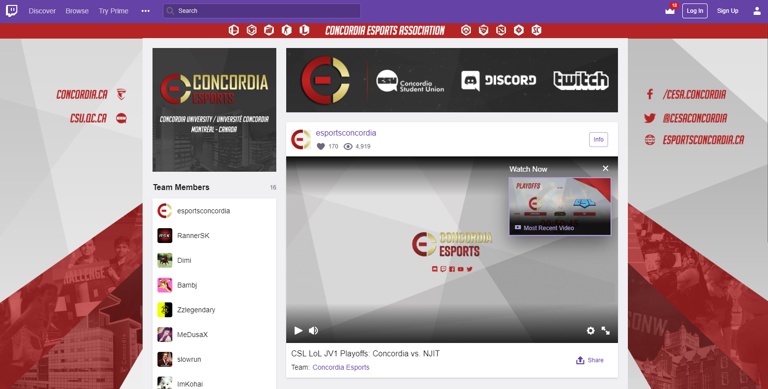
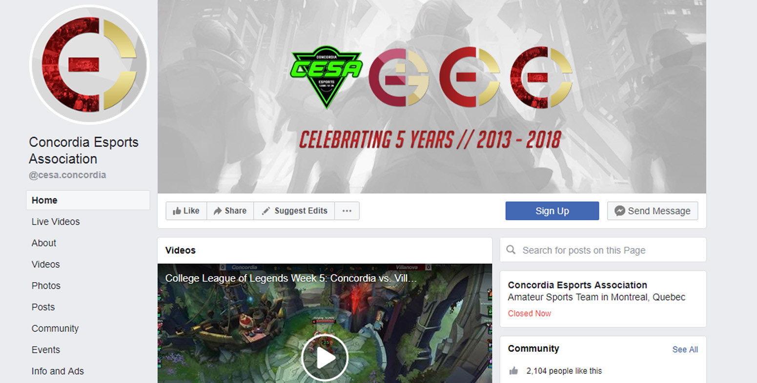
SOCIAL MEDIA
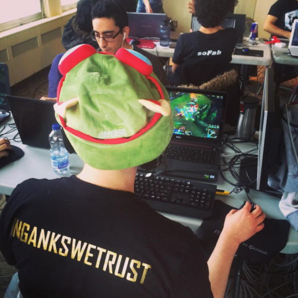
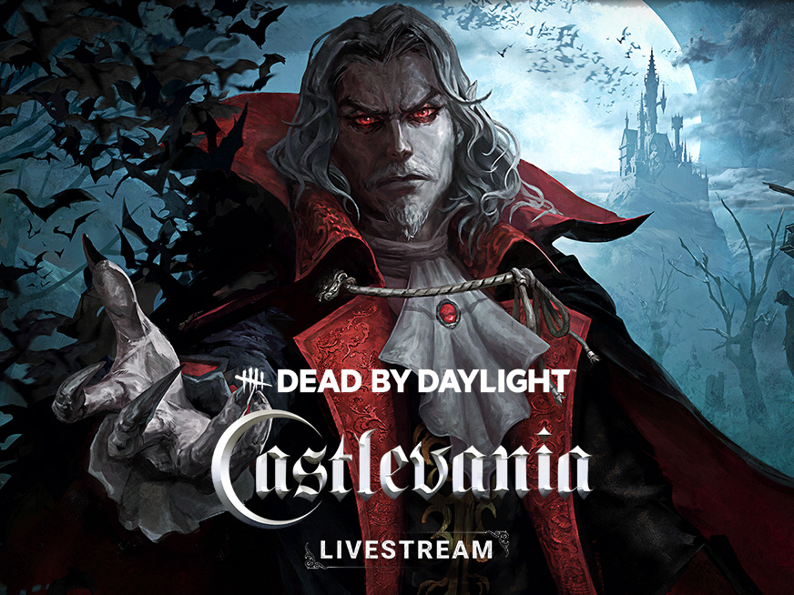
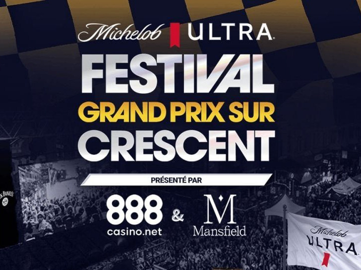
As a student run organization, getting close to our young audience meant we needed to have a cohesive social media strategy. Continuing the colours, motifs, and slogans throughout all our various platforms.
MERCHANDISE
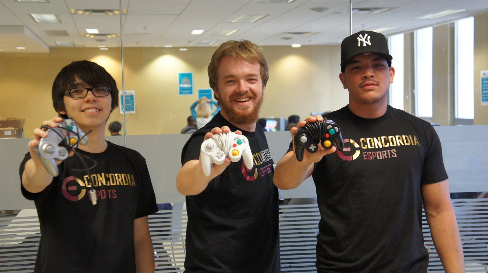
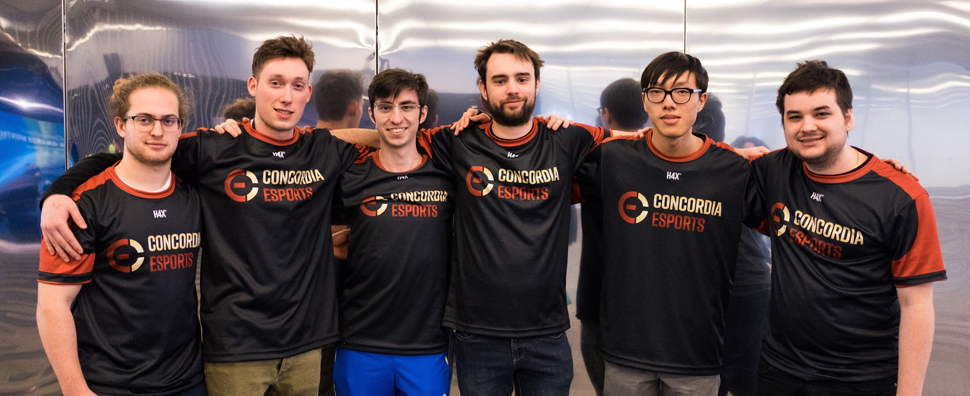
Players need jerseys. Jersey's not only serve to identify someone with an organization, in our case they were a source of school pride. Players and fans both gravitated towards the merchandise and made them truly a rallying cry for our group.